In This Post
Can paint color actually help reduce anxiety, make you feel calmer, more focused and productive? In this post, I’m looking at what the research says, sharing some of my favorite paint colors for creating spaces that support focus and calm, and explaining why the shade you choose — along with lighting, contrast and everything else in the room — matters just as much as the color itself.
———————————————
This post includes affiliate links
6-minute read…..
———————————————
Why Paint Color Matters When You Need to Focus & Be Productive
Well, we’re officially in September again, and that means most of us are back into our regular routines. Kids are back at school. Work is in full swing. Activities have started up again and our schedules are filled with homework, meetings, practices, appointments, deadlines and long TO DO lists.
It’s a lot of pressure. Not only is there the pressure to fit everything in and get everything done, but there's also the pressure of getting everything done well.
While we’re busy meeting deadlines, solving problems and trying to perform at our best, our kids are trying to succeed at school by keeping up with assignments and studying for exams. All of these demands can leave us feeling stressed, anxious, distracted or overstimulated when what we most need to do is focus so we can be productive.
This is where the design of the space around us can help. It's also why today I'm sharing the best paint colors for focus, productivity and reducing anxiety during the busy seasons of our lives.
[Pin it for Later]
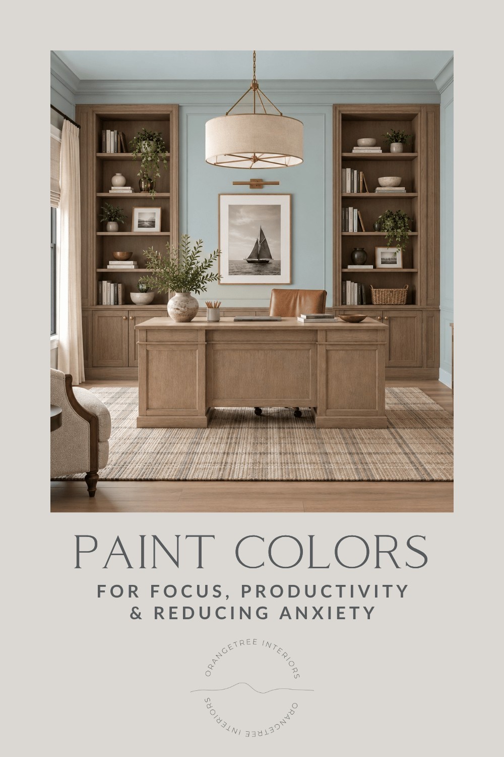
In 2025, a review of 132 peer-reviewed studies involving 42,266 people in 64 countries found consistent associations between color and emotion.
It turns out that blues, greens and blue-greens were associated with positive, lower-energy emotions such as relaxation and contentment, while yellows and oranges were more commonly associated with positive, higher-energy emotions.
Now, I want to be clear that this doesn’t mean blue walls will magically make you feel more relaxed or yellow walls will automatically make you more productive, but it does reiterate something that those of us who work with color already know……
Using color can help to create feelings when used "intentionally."
So where do you start?
Start with How You Want the Room to Feel
When I’m helping someone choose a paint color, I don’t just consider what colors they like. I also want to know how they need their space to function for them and how they want the room to feel when they’re in it.
For example, if you’re already running at 100 miles an hour with emails coming in, papers that need filing, deadlines looming and six unrelated thoughts running through your head, you probably don’t need an office that adds even more stimulation. Instead, I’d be more likely to suggest a soft, quiet color palette with muted colors and little contrast.
Some of my favorites for this kind of space are Sherwin-Williams Silverpointe SW 7653, a muted blue-green; Benjamin Moore Gray Cashmere 2138-60, which sits beautifully between green, blue and gray; and Farrow & Ball Cromarty No. 285, a soft green-gray.

SHOP THIS BEDROOM
Get a sample of Benjamin Moore Gray Cashmere here.
Bed | Desk | Rug | Art | Light | Woven Shades | Drapes
Or maybe you’re quite the opposite.
Maybe it’s 2:30 in the afternoon, you’re staring at your computer and your beige-on-beige office isn’t inspiring you to do…well…anything.
In that case, I might suggest bringing in a little more warmth or visual energy. Benjamin Moore Golden Straw 2152-50 is a creamy, subtle yellow, or you could try something deeper like Farrow & Ball Sudbury Yellow No. 51 which has more presence and could be beautiful on cabinetry, built-ins, or on an accent wall.

SHOP THIS BEDROOM
Get a sample of Benjamin Moore Golden Straw here.
Light | Dresser | Bed | Desk | Chair | Rug | Woven Shades | Drapes
Both spaces need to support focus and productivity. They just do it differently.
How Color Changes the Feel of a Room
It’s no secret that color has always been one of the tools I use to help establish the mood of a room.
Blue is a color I often use when I want a room to feel peaceful, restful and relaxed, which can help to counterbalance feelings of anxiety. Sherwin-Williams Topsail SW 6217 is one of my favorites for this. It’s a light, airy blue-green that adds color without feeling overly colorful.
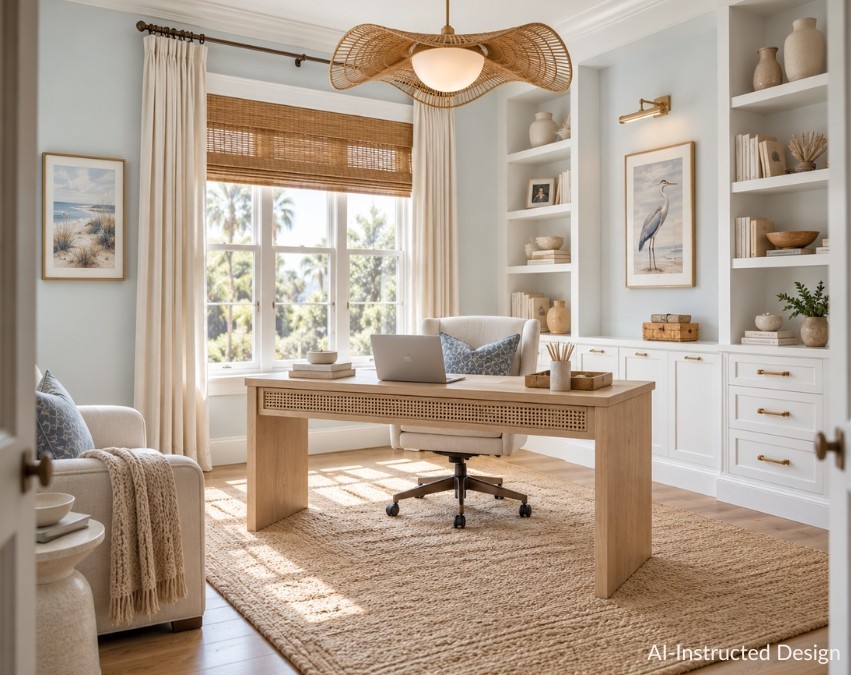
SHOP THIS HOME OFFICE
Get a sample of Sherwin-Williams Topsail here.
Desk | Office Chair | Rug | Light | Picture Light | Heron Art | Beach Art | Pillows | Woven Shades | Drapes
For something with a little more depth, I love Benjamin Moore Smoke 2122-40. Its grayed blue-green appearance is a great example of how a color can have depth without feeling overly intense. It helps induce the same feelings, but with more presence.

SHOP THIS HOME OFFICE
Get a sample of Benjamin Moore Smoke here.
Desk | Rug | Arm Chair | Side Table | Office Chair | Pendant Light | Picture Light | Art | Drapes
Green is another favorite when the goal is to calm so there's more room for focus. Soft sage green, muted greens, and light or mid-tone blue-greens introduce color without necessarily demanding much attention. Sherwin-Williams Liveable Green SW 6176 is a great example - it's a soft green with warmer yellow-gray undertones that keep it from feeling too cool or minty.

SHOP THIS HOME OFFICE
Get a sample of Sherwin-Williams Liveable Green here.
Desk | Rug | Arm Chair | Side Table | Light | Tree
Yellow brings something different to a room. It’s cheerful, warm, lively and engaging, which can be great when a space needs more energy as seen here with Benjamin Moore's Candlelit Dinner 295.

Source
Get a sample of Benjamin Moore Candlelit Dinner here.
But these are all generalizations. Saying “blue is relaxing” or “yellow is energetic” only tells us part of the story.
The SHADE Matters Too
Think about a light, lime green versus a soft, muted sage. They’re both green, but do they create the same feeling in a room?
No. You can see in the images below that each paint color has its own vibe.

Get a sample of Benjamin Moore Limesicle here.

Get a sample of Benjamin Moore October Mist here.
[Shop it or Pin it for Later]

Research supports this as well. Color-emotion associations aren’t driven by the hue alone. Lightness and saturation levels are also important factors. For your reference, saturated colors are generally associated with greater arousal and engagement, whereas less saturated or muted colors are generally associated with lower arousal and greater calm. Therefore, muted or less saturated colors are better for focus and productivity.
Can Paint Color Help With Anxiety?
There are definitely paint colors I would consider when I’m trying to create a room that feels less stressful and more calm, but I wouldn’t tell you that painting your bedroom blue or your home office green will treat or cure anxiety. That’s a medical claim I can’t support.
What I do know is that soft blues, muted blue-greens and subtle, neutral greens are consistently associated with positive, lower-arousal emotions such as relaxation and contentment. That said, blue and green aren’t your only options.
If you prefer warm neutrals, Benjamin Moore Pale Oak OC-20 is a longtime favorite of mine. It creates a soft, uncomplicated backdrop without becoming the focus of the room.

Source
Get a sample of Benjamin Moore Pale Oak here.
For something even lighter, Benjamin Moore White Dove OC-17 is a soft, warm off-white that can keep a workspace feeling comfortable without the starkness of a very crisp white.
Please note that you can’t simply rely on paint colors or color alone to do all the heavy lifting when it comes to creating a feeling in a room. Lighting, pattern, contrast, clutter and everything else in the room contribute to how visually demanding a space feels.
If you’re already feeling stressed or overwhelmed, I’d generally look toward softer, less saturated colors and a lower contrast palette, rather than searching for one magical “anti-anxiety” paint color. The goal isn’t for paint to fix anxiety. It’s to create a room that isn’t adding unnecessary stimulation when what you really need is somewhere that feels easier to be in.
Do Undertones Matter?
In short, YES.
Undertones influence paint colors and therefore the overall feeling paint colors help to create.
Turquoise feels completely different from a blue-green with gray undertones.
A rich, earthy yellow feels completely different from a sunny, cheerful one.
A warm greige feels completely different from a cool gray.
And so on…
This is where choosing paint colors gets more nuanced than simply saying “blue is relaxing” or “green is calming.”
Telling someone to “paint it green” is easy. Finding the right green for your flooring, furniture, natural light and the feeling you’re trying to create - that’s where the actual design work comes in.
Lighting Impacts Color
If you’ve ever chosen a paint color at the store, then brought it home to put on your wall and thought…What on earth happened?!….then you already know the impact lighting can have on your space.
Color doesn’t exist independently of light. North-facing versus south-facing light, morning versus afternoon, your lightbulbs, flooring, cabinetry and furniture can all change how a paint color appears in a space, which is why I will forever tell you to…...
SAMPLE YOUR PAINT COLORS!
Seriously. Don’t skip this step. ;)
Paint Colors Aren't Doing All the Work
Let’s say you’ve chosen a soft blue-green paint color like Farrow & Ball’s Light Blue for your home office. It could make your office into a beautifully calm space that helps you focus.
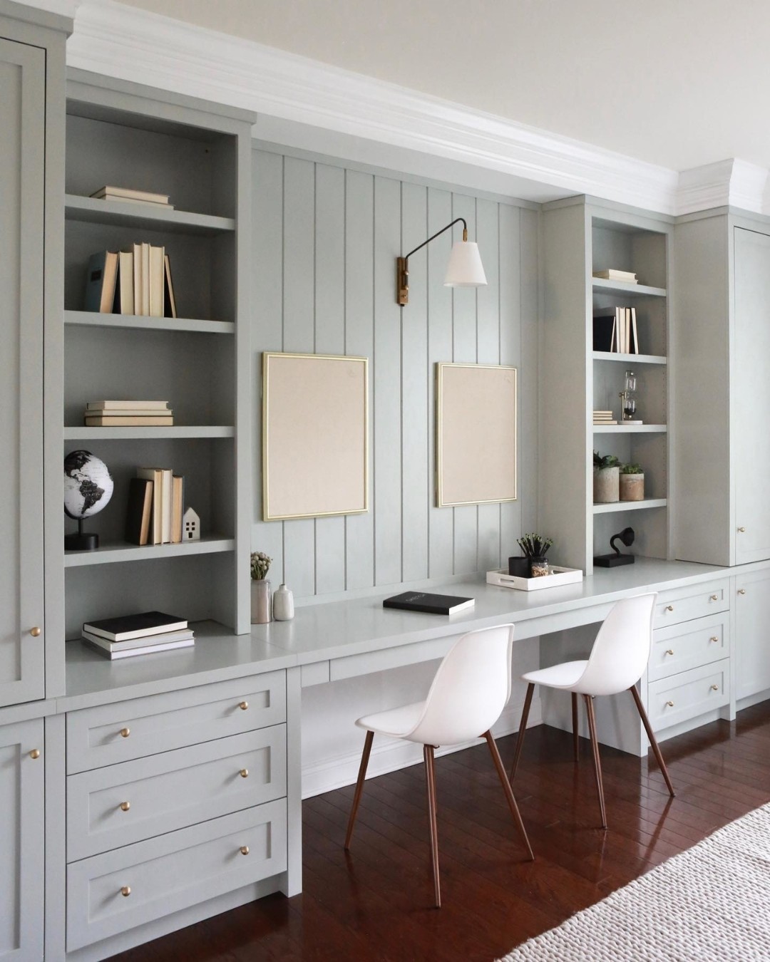
But if you add a bold patterned rug, have cluttered bookshelves, overdone walls, and a desk covered in papers, you’ll likely have undone some of the visual quiet you were trying to create.
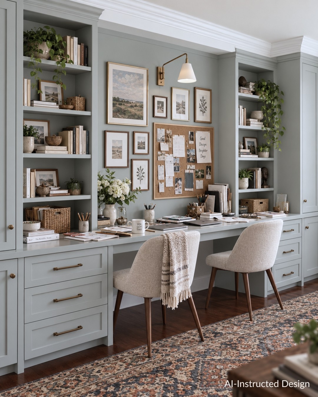
If your goal is better concentration, you need to consider the entire visual environment — color, contrast, pattern, clutter, artwork, storage and anything else directly in your line of sight.
Some people work beautifully with lots going on around them.
Others need to clear off the desk before their brain will cooperate.
Sometimes the best paint color for focus isn’t magically making you concentrate or be more productive, it’s simply one part of a room that isn’t constantly competing for your attention.
Which is More Important? Liking a Paint Color or Paying Attention to its Character Traits?
Both.
Everyone responds to color in their own way. Our experiences, associations, preferences and even the context in which we see a color can influence how we respond to it.
So if someone tells you green is the best calming paint color, but you don’t actually like green……don’t paint your office green in the name of science. ;)
Your space still needs to feel like you.
So, What Is the Best Paint Color for Focus and Productivity?
There isn’t one.
The better question is: What do you need from the room? If you’re already stressed, distracted and overstimulated, I’d look toward softer colors, less saturation and lower contrast.
If the room feels flat and uninspiring, a little more warmth, color or visual energy may be exactly what it needs.
And if you’re choosing a paint color for your child’s study space, think about them. Do they get distracted by everything around them? Or do they thrive in a room with more color and personality?
Color is just one of the many tools we have as designers to influence the experience of a room.
When we combine the right paint color with good lighting, comfortable furnishings, useful storage and the right amount of visual stimulation, we create spaces that don’t just look beautiful, they support the people who actually have to live, work and study in them.
[Pin it for Later]

GET SAMPLES OF MY FAVORITE PAINT COLORS FOR FOCUS, CALM & PRODUCTIVITY
Final Thoughts
There’s no single “best” paint color for focus and productivity, or releasing anxiety. The goal is to choose a color and create a space that gives the right balance of calm and stimulation for you.
Need help finding that color? Book a Design Advice Session and I’ll help you choose a paint color that works with your home, your style and the way you want your space to feel.
Until next time,
Val xo
RELATED READING
The Fastest, Easiest Way to Choose Paint Colors for Your Home
Best Coastal Paint Colors for a Relaxed Beach House Interior
Coziest Paint Colors for a Warm, Inviting Home
YOU MIGHT ALSO LIKE
Cozy Fall Home Decor & Fall Color Schemes
Elevated Fall & Winter Themed Tablescapes
Let's talk about your project. No pressure, no obligation, just a friendly conversation about your vision and how we can help bring it to life.